Sunday, 21 March 2010

Lord Of War- Opening Titles- Ed Boyce


The Lord Of War titles are exceptional and probably the most enjoyable ive seen.
The titles are superimposed onto the film and the font is bold and white.
The opening titles form there own mini narrative. This is down from the Point of view of a bullet.

From the POV of a bullet we go from construction of the bullet, to the bullet being shipped to other countries and loaded into a gun.
The music is rather controversial to what you would expect to hear as it is an upbeat country song for a war film-not what you would expect.
At the end we are seeing out of a gun barrel and you can see that there is war going on. The bullet is fired and goes into a kids head. This was quite a brutal way to end the credits but it sets the scene well for a war film.
I personally thought the titles were great and they really stood out to me. From the POV of a bullet it just made them interesting, although i did feel a bit sick at times when the bullet was spinning around

Fight Club-Opening Titles- Ed Boyce

At first it is hard to determine where the titles are taking place- i first thought it was a cave.
For the first 10 seconds or so it is confusing what it is.
  • The titles are taking place in the fear centre of someones brain.
  • The font flashes up like lightning in the middle of the screen. The text is futuristic looking.
  • The flashes represent fear based impulses in the brain.
  • The shot moves through the brain more and then leaves via a pore in someones face.
  • The shot is extremely close and because of this its hard to make out what we are seeing, but we see hair and we know that its someones face. The camera then travels up the barrel of a gun. But again i didnt relise it is a gun straight away, the first time i watched these titles because it is so close.
  • The sound is fast paced to match these titles.
The fight club titles are great in my opinion, they are fast paced and completely different from anything ive seen in titles before. They are interesting to watch and because of this i think its a great opening, because as a view i expected a great watch from these abnormal titles.

Schindlers List- Opening Titles- Ed Boyce

The opening titles of Schindler's list are superimposed onto the film.
We see a religious family praying whilst candles are being lit. The credits start and we see a new credit every shot. With every shot we see the candles get smaller and smaller. In my eyes this is ment to represent hope or life, which is ending.
  • The font is old fashioned like the film and the font is always white.
  • The main title of 'Shindlers List' is placed on a black background and underlined by the white table. It is also placed inbetween the two candles and looks very bold.
  • The music in the titles is a quiet relaxing piano. Each shot fades into the next which makes the titles feel slow.
Everything combined sets us up for an emotional watch.

Monday, 15 March 2010

Ed Boyce - Orphanage Titles


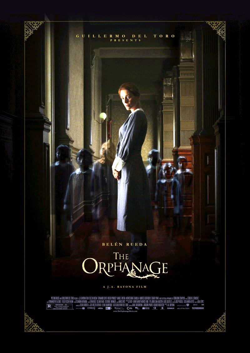
The Orphanage
The main titles in the Orphanage don't start until 3 minutes into the film after we have been introduced into the scene of the film. The first shot we see is children playing a game in a field, this of course fits in with the title as you would expect to see children at an Orphanage.
The titles start after we hear the phrase "Got you", from just viewing the titles we do not know if this has any relevance to the film.
Titles
  • Titles are shown by children's hands ripping wall paper off walls to "reveal" what's underneath.
  • The wall paper looks outdated and we see big cracks in the wall, this is purposely shown to us so we get the idea that the place is old.
  • The hands of the orphans look cold and dead.
  • The final title is the main one, "El Orphanato" (The Orphanage) this title we see all of the children's hands frantically trying to grab hold of the paper and then ripping the paper off to reveal the title.
  • The main point i get from the titles is that there are secrets in the Orphanage that are being revealed.
Sound
  • We hear the sound of wall paper being ripped off.
  • The music is soft like a violin or piano playing. It is eerie and it also creates suspense. The use of violins in this scene and others like it is affective as it is an unnerving sound that has a big contrast from the idealistic scene of the children playing in the sun.

Thursday, 11 March 2010

Ed Boyce- Old Boy

Old Boy


The credits in Old Boy start 3 and a half minutes into the film. When they start they are super imposed onto the main character.

Titles
The first sign of the titles is the digital time shown on screen this then transforms into writing.
The numbers change like you would see on a train time board.
The digital time fades and we then the credits start. The credits switch between the digital time and writing. There are Chinese symbols either side of the writing. The symbols turn clockwise like an analog clock. This simulates the hands of a clock turning.
After this the credits continue, but they are shown over images of distorted clocks. The sound of a grand father clock goes off but the sound is distorted. The distortion raises confusion in the audience. Both digital and analog clocks are shown now. The clocks are ticking the wrong way, this makes us think that there is something strange going on in this film. As the main title shows there is a graphic match between the clock, the letter "o" with a "y" inside of it. The "y" and "o" then form the title old boy. The "d" and "y" of the title turn round again like and analog clock, letting us know that time is important in this film.


Wednesday, 10 March 2010

Film titles and credits - Misery - Mathew Garrett


The credits and title in this film last for about five minutes, during moving images. These credits have been overlaid/superimposed over the moving images giving us a chance to see some of the film and the credits.
Title
The credits in this film begin once we see the character start driving. Each of the credits dissolves out. Each of the credits has been carefully placed on top of the images so that we are still able to see the action taking place. Some of the credits have been placed in shadows and along lines so that they stand out. At one point there is an extreme long shot as the car drives along the side of the cliff and a credit appears. The car follows the line in between the credit so that we are still able to see the vehicle and it makes it more interesting for the viewer. The coulour of the credits being red, could suggest different things such as this film could be about love whcih is associated with the colour red. Or it could be viloent and dagerous, these also are associated with red.
Music
The music in this sequence is contrapuntal as it is cheery and up beat, whereas the film genre, thriller, tends to have more eerie and tense music.

Film titles and credits - 10 Things I Hate About You - Mathew Garrett


In this sequence, the credits and title are written in a rough, scruffy hand writing. Apart from two credits, the rest are overlaid/super imposed onto moving images.
Title
The main title of the film is the first to be shown over moving images. The title has been made to look like someones scruffy hand writing in what possibly could be either a crayon, or by quickly brushing it on using paint. The title and credits dissolve over the moving image and we are able to see the background, the city in which this movie has been set. The title and credits appear to shake and appear to be three different images flicking between each other. The titles and credits appear in a childish manner as the crayon/paint style of the title suggests. Also, they have been drawn in bright colours which could suggest youth and child like behaviour in this film. Each credits has been overlaid onto interesting shots. Each shot is interesting because of the use of a crane or jib, panning along the scenery. During action in the film, the credits are off centred so that we can see the more important image in the background. Each credits has been carefully chosen so that it does not block the audiences view and we are still able to see both credit and moving image clearly. The Credits do not stop until nearly 5 minutes into the film.
Music
This film was made in 1999 so it has 90's music. The music in this sequence is common to that time and is a popular teenagers track, One Week by Bare naked Ladies. This music slowly fades away and is covered up by Bad Reputation by Joan Lett, another popular track at the time. However this track is louder and more aggressive than the previous. These tracks represent teen culture at the time and represent the theme of the film.

Tuesday, 9 March 2010

Film Titles and Credits - Spider-Man - Jess D'Alvarez

  • The Spider-Man titles are a mini-narrative. The min-narrative seems to tell a story and briefly introduces the audience to the film and the character(s)
  • The mini-narrative begins by showing a web and then parts of the main character (protagonist), Spider-Man, appear. For example, the colour red is then shown next, which we associate with Spider-Man due to the colour of his costume. Spider-Man's arm, then hand, body, back and then head are shown, each in different shots. So most of the protagonist is revealed even without the audience seeing a full shot of the protagonist and they can now picture what they think the protagonist looks like, in their heads. The antagonist is then shown and following this some of the setting is shown i.e. buildings. And from these shots in the opening titles, the audience can gain an insight into what the film will be about.
  • Some of the shots have a dark blue/black background which I think represents the night sky. The text is white, which I think could resemble a web, it does look as though it has been made to look like the text has been spun from a web.
  • The title 'SPIDER-MAN' appears very early on in the titles and is silver in colour, it seems to shine which I think links to Spiderman's costume as he has silver web over his costume. I think the shining was also used to emphasise the title as it is the name of the main character. The music also gets faster at this point, emphasis again.
  • Other background of shots are very dark, I think this is to ensure that the webs and writing are visable and clear to see for the audience.
  • The writing in the shots is not placed right in the middle of the shot however it is placed in line with the web like the picture to the left. Each letter is placed between the web, possibly to resemble a fly/insect caught in the web. This also makes the shot look more interesting.
  • The shots seem to flip/ into one another. I think thise could relate to tthe spinning of a web.
  • Film Titles and Credits - 500 Days of Summer - Jess D'Alvarez


    • Short, maybe 2 minutes, of film before titles begin. This film at the beginning has a commentary and tells the audience what the film is about 'boy meets girl'.
    • Titles start off with black background and moving image/video of boy to the left of the shot and then title to the right of the shot.
    • Typography is very simple, white, plain, easy to read on black background.
    • Moving images/videos show the growing up of a boy and a girl. The boys moving image/video is always on the left and the girls is always on the right.
    • These titles could be seen as a mini narrative because the moving images/videos shown the growing up of a boy and girl. At start the commentator explains the 'this is a story of boy meets girl' therefore we can relate the moving images in the titles to the, what seem to be, two main characters, Tom and Summer.
    • On other shots, there are still the moving images/videos but the text is superimposed over the small videos and can sometimes be hard to read because of the bright colours of the videos.
    • Colours in videos are very bright. They show children happy, smiling and laughing. This creates a happy atmosphere. The music that accompanies the titles also helps to create a happy atmosphere as it is very fast, jumpy, happy with woman singing.
    • I do not think anything has been edited throughout these titles, however the shots to not abruptly move from one to another, the moving image/video and text seems to fade, therefore this has been edited, however the moving images/videos just seem like normal 'home movies'. I think that fact that the titles use 'home videos' means that the audience can relate to what happens to the characters in the film.

    Film Titles and Credits - Se7en - Jess D'Alvarez

    • Titles begin after 4 minutes of film. These 4 minutes give an insight into what the film is about.
    • The titles are not superimposed over a moving image, they form their own mini-narrative. I think the story of the titles is about a criminal trying to cover up his/her actions.
    • Typography is very plain and simple, white writing on a black background however the writing is somewhat scratchy and seems to flicker in the titles, this could possibly relate to electricity. I also think this as the music played in the background makes a electricity type sound, which would link in with the scratchiness of the words.
    • I think the movements of the titles seem to reflect that of static electricity, which could relate to the film.
    • I do not think that the titles/names on the black background are positioned in the shot for any specific reason other than just to make it more interesting than sticking them bang in the middle of the screen, however there are other shots where the titles/names are superimposed over pictures or maybe a moving image, therefore they seem to be placed on a part of the screen where they are easily read by the audience.
    • I think that all props and objects in shots seem to be related to those of a killer. For example there is a shot where the person is scraping off their fingerprints. When I saw this I instantly thought of a criminal trying to cover up the crime that he has committed. This element of mise en scene indicates that the titles/credits are those of the thriller genre. There are also pictures of disfigured human faces, could be the victims of the criminal.
    • Seems to be a book that the criminal is creating, shots of the book are shown. This prop, an element of mise en scene, again indicates that these titles could be those of a thriller.
    • Red is shown is some of the shots, this could again indicate that these are titles for a thriller because we usually associate red with blood and blood with thrillers.
    • I think that many close ups, big close ups and extreme close ups have been used in order to show and emphasise the actions of the 'criminal' and to possibly raise questions in the audiences minds about the upcoming film.

    Music/Sound:

    • The background music is very technical, kind of futuristic.
    • When the titles/names of actors appear (in their scratchy typography) different sounds are made, all of which I think relate to electricity. I think these sounds are used in order to emphasise the title/name.
    • Music is of a slow yet steady pace throughout the titles and slowly begins to build, getting faster and more up beat and then 'You've got me closer to God' is said at the end which makes me think that there may be a religious aspect to the film.
    • Music begins to build and then more action in shots is shown, more of the criminals activities are revealed

    Editing:

    • Editing to double shots and repeat shots has been used. For example at 4:32, the image of the hand, holding a pen and writing on the piece of paper, has been doubled. I think this was done in order to either make the shot more interesting, to emphasise the action that is taking place, could be important for the min-narrative or to just simply fit in with the 'futuristic' 'electric' atmosphere of the titles.
    • I think the colour of the shots may have been edited in order to make it look more dull and possibly haunting as brightly coloured shots would not fit in with the thriller genre.

    Film titles and credits - Napoleon Dynamite - Mathew Garrett


    In this opening credit sequence there is no moving image before the credits. The credits are the moving image. Int his sequence the writing has been hidden, but is also supposed to be obvious.
    Titles
    The first credit is brought on screen on a dining plate. The writing has been written in what looks like tomato sauce. This could suggest that the film has a theme of food throughout but it is not definite. The first three are all written in some sort of sauce. After these three we start seeing the credits written, and hidden in everyday things such as U.F.O Abduction Insurance cards, and Student I.D. Rather than showing a name and then who he/she plays, the main character is only shown via a picture on the Student I.D card. After the main character other actors names appear, also written in sauce on on plates of food. These foods could be significant to each character or could mean something about each character and also could represent something shown/said in the film. The last name, Diedrich Bader, is shown on a silver star which could represent something about him in the film. After the actors names the crew's credits become apparent and there are hidden in normal things."Casting By Jory Weitz" which had been written in a Library return card. Jeremy Coon, the producer, has had his name printed on a sweet box that looks normal and doesn't look out of the ordinary. The credits are very graphical in this sequence. The last Credit, is written on a burger in what looks like mayonnaise and the moving images stop as soon as the burger bun gets smacked down on top of the writing. It fades to black and the film begins. The main title itself isn't revealed until 5 minutes into the film, during moving image. The tile is revealed as a name written on a school desk.
    Music
    The music doesn't start in the film until the production names disappear and the actors names begin to show. The Music in the credits is calm and relaxed which suggests the mood of the film will be the same. The Foley in this sequence is mainly birds twittering in the background.

    Film titles and credits - Casino Royale - Mathew Garrett


    The film Casino Royale has an extremely interesting Title and Credits sequence. The Credits, however, do not start until 4 minutes into the film. The moving image before the credits is black and white so that there is a sudden burst of colour during the opening credits.
    Titles
    The Credits begin with what is supposed to be blood running down the screen. This becomes the back ground of the first credit. Once the first credit disappears we see different playing card symbols moving around in different patterns and this connects to part of the title, Casino. The credits dissolve as the background changes colour. The main title itself, "Casino Royale", do not stand out that much. However, you are drawn to it as it is the only thing on screen. The title also keeps the playing card symbols in the background which becomes a recurring theme in the opening credits. After the title, the background changes style. It still keeps the same theme, playing cards, but uses the designs of the cards more. The Jack, Queen and King playing cards all have there own design of patterns and symbols on cards, and these are represented in this sequence. The Spade symbol is used to represent bullets in James Bonds gun as he loads the magazine. When the credits are shown they are never in the centre, after the main title that is, they are always left or right. This is because whoever designed the opening credit s sequence chose to have the action/moving image on one side and the writing on the other. Buy doing this it means that the viewer can see both moving image writing so that neither one is more important than the other. One credit, however, is centred and this is Judi Dench. Her name is trapped by Spade and Club symbols flying past her which suggests that she is a character that gets trapped in the action. At one point there is one mans name, Jeffery Wright that is surrounded by guns which suggest that this actor might be surrounded by danger which is shown as the guns being fired. During a fight seen amongst the credits, the people who are either killed or just knocked out turn into different card symbols. These people, at this point, are only represented in different shades of red and this colour is usually associated with either Danger or Love. In this case it is danger. The fact that these characters are the same colours suggests that they could be from the same group or organisation. After a fight scene there is a long pattern which looks as if it is off either a King or Queen card, and this breaks when the credits are shown above. The fact that the closer of the two credits is the Stunt coordinator could signify danger and the image being blood pouring from a vein. At the end of the credits we see the card number 7 being shot twice. These two bullet holes then , using a graphic match, become two zero's and become Bonds status in rank.
    Music
    In this opening credits sequence there is no Foley sound, only music. The music was written specifically for James Bond and this plays throughout the whole of the credits. Halfway through the credits, a gun is brought u in view and a shot is fired just as a louder, Bass part of the music becomes apparent. At the end of the credits and music Bonds face is covered in black sections. This is matched with sudden sounds such as cymbals.

    Monday, 8 March 2010

    Film titles and credits - Old Boy - Mathew Garrett


    The credits do not start until three and a half minutes into the film. In this sequence the credits are overlaid/superimposed onto moving image of the main character we are introduced to, Oh-Dae-Su.
    Titles
    The credits transform in this sequence. The first sign of the credits a digital time shown on the screen which then transforms into writing. The digital numbers change by turning and flickering from number to letter. This simulates what could be a message board like you see at an airport with the flight cancellations. The credits start as numbers, then to writing, then to numbers, and back to writing and so on. Once the writing appears not significant symbols and letters begin to turn exactly like the hands on an analog clock would. This simulates either a watch or a traditional wall mounted clock.
    The moving image then changes to animated, and distorted moving image of clocks and time related objects such as stop watches. The clocks become distorted and have been bent as if the laws of physics to not apply to them, which also ties with the theme of time as the hand on the clock (which also shows digital time) begins to go in reverse which also means that time has been altered and distorted and messes with laws of physics. As the main title begins to show we see a clock and there is a graphic match between the clock, the letter "o" with a "y" inside of it. The "y" and the "o" then transform into the title "Old Boy" which is also underlined by changing numbers
    Sound
    The music doesn't start until another minute after the credits start. The music is exciting to begin with and it, to me, creates the image of a superhero style movie, with music similar to Spider man. The classic heroic music can be recognized by all film fans. As the credits go on the music becomes quicker in pace and becomes more tense. The sound turns distorted just like the images later on.

    Film Titles and Credits - Vertigo - Jess D'Alvarez

    • Credits start at beginning of the film.
    • Titles are superimposed over image of women's face.
    • Start off with extreme close up woman's face, in black and white.
    • Focuses in on lips and then first titles/name appears above the women's lips. I think it is placed here in order for the audience to see it clearly, as there is a plain/blank background (women's face) so that is doesn't obstruct the viewing of the women's lips and that they are still clear.
    • Then focuses in on eyes and the titles/name has now been placed below the eyes. I think this is because if it were to be placed above the eyes then it would obstruct the viewing of the eyebrows. It could also be placed here in order to draw attention to the women's eyes, as they are moving and looking around at this point, is she scared?
    • Extreme close up of the eye and title/name is placed under the eye, again possibly because it is more visible here and shows that the eye could be an important part of the film?
    • Camera zooms into the eye and the shot turns red, does this relate to the thriller genre?
    • A white spot in the eye, becomes bigger and turns into the main title 'Vertigo' and is placed in the centre of the screen, to be the main focus of attention.
    • A spiral forms in the eye and then the shot fades to a black background with the spiral spinning. The titles shown in this shot are written in white, and because it is on a black background it is very clear to see, I feel that this is a possible reason for the colour choices. However there is a shit where the spiral in the background is blue, and the writing still white, but the writing is not as clear to read, and therefore will make it difficult for the audience to read.

    Sound/Music:

    • Music is slow, then picks up the pace and becomes louder and sharper when a title/name comes on screen, I think this is just for emphasis and to add suspense.
    • Music becomes faster at end of titles as action begins.

    Film Titles and Credits - Old Boy - Jess D'Alvarez

    The titles for 'Old Boy' are really quite strange.

    1. There are 40 seconds of beginning credits.

    2. 31 seconds of film, two men on a roof, I don't understand what this bit has to do with the rest of the film

    • The non-diegetic sound in this part of the titles is very loud and the audience are only slightly able to hear the dialogue between the two characters.
    • It is very fast paced and dramatic. This makes the scene very suspenseful and keeps the audience on the edge of their seats.

    3. Then cuts to some more action, drunk man at police station. Man comes to collect the drunk man and they go to the phonebox.

    4. Main credits are superimposed over the shots, when men are in the phonebox

    • The first credit that appears is the digital time, it then morphs into more credits, this time showing words.
    • The digital time appears and exits the screen similar to a train stations display information board.
    • Throughout these credits the digital time is shown, when new names/directors/producers etc appear on the screen.
    • Chinese symbols appear and some of the chinese symbols, random ones, move as though they are imitating the action of the second hand on a clock.
    • Music starts a minute after the credits begin. I think this music is used to create suspense as, Dae-su, who looks to be the main character, has gone missing.

    5. At 5:03 minutes into the titles, a mini narrative is now played.

    • Distorted clocks, both digital and analogue time are shown.
    • Can hear the ticking of the clocks, the sound of a grandfather clock when it reaches each hour and also the sound of a cuckoo clock. These sounds are also distorted in some parts.
    • The shots in this mini narrative fade into each other and graphic matches are used as each clock in each shot morphs into another clock in the next shot.
    • A clock, graphic matches with the 'O' from 'Oldboy' and the hands of the clock, graphic matches with the 'Y' from 'Oldboy'.
    • The 'D' and the 'Y' from 'Oldboy' resemble the actions of a second hand, ticking on a clock.
    • As the main title is shown 'Oldboy' numbers appear underneath.
    • Throughout this mini narrative, the time and numbers appear as many times as possible, however there is no indication during the first 5 minutes of the titles, as to why this is.

    Special Effects

    Blood


    For our film we needed to make blood packs for the "stabbing" scene. The blood consisted of red food colouring, water, and glycerin to make it thicker. This mix was placed in four sandwich bags which were taped to make sure nothing leaked. The blood packs will be placed behind our fake skin/dummy


    Fake Skin


    The fake skin was tricky to make but after a few tries I managed to get it just right. The fake skin was made out of liquid latex which by painting it on a tray in layers forms a strong skin like material perfect for our murder scene. To make this I used the liquid latex and painted it on a smooth tray. I did this five times and then finally applied some toilet paper over the top and then another layer of liquid latex. Once this had dried, this proved to be a very good way of making fake skin.


    Mathew Garrett

    Filming

    Problems whilst filming:
    As a group, we decided to film on Sunday 7th March as this was when we were all available. We met at around 5 o'clock and waited for it to get dark so we were able to film our first few shots of our male character walking to the victims house. However when we went outside we found that it was too dark and we unable to see our character in the camera. We then moved to an alleyway where there were many street lights and we were able to see our character walking but there was a problem with our camera as it wasn't focusing on our character. We then decided to put our camera into night mode, however there was a 4 second lag and it made our filming look very poor. In the end we decided not to film the first few shots of our short film on that day and have made arrangements to film them on Tuesday 9th March. We have now successfully filmed our outside shots. We chose to shot at around 6:15 as it was light enough that we could see Fred walking to the house and it was also an acceptable darkness for us.

    Changes:
    As a group we decided to alter our bathroom scene. Originally, we had our killer, Fred, knock Katie out by hitting her on the head with the handle of the kitchen knife. However this proved to be too dangerous and ineffective. We had to consider the safety of our actress, therefore we decided that our killer would smother Katie with a flannel covered in the chemical chloroform. We achieved this easy and found it to be much less dangerous than the use of the kitchen knife.

    The Stabbing: Our 'dummy' (below)
    The stabbing is proving to be a difficult element to our short film. Our original idea was to make a cast of Jess' top half, using duc tape and then stuffing it with newspaper. We then taped a blood bag to the inside of the 'dummy' around the spot where we wanted Fred to stab Katie. We were then hoping that the stabbing would be smooth and look real, however this it did not. When stabbing the 'dummy' it just caved in and therefore did not look like a real body. We then tried to make the 'dummy' sturdier by adding cardboard and anything we could get our hands on to make it that little bit more sturdier. However, this did not work and therefore our attempt to show the stabbing of our victim, failed.


    Having this idea fail, meant that we needed to come up with a new idea as to how we would show the stabbing. We then watched some clips on YouTube to get an idea as to how stabbings are shown in films. We looked at the stabbing scene from Zodiac and The Strangers. Having looked at these we realised that we would never be able to achieve a stabbing scene like these films because we are on a zero budget and they have millions of pounds to use in order to achieve what they want. In the Zodiac clip they only show the man's facial expressions whilst he's being stabbed, however they do show the women actually being stabbed. We thought of a number of ways that they could've achieved this.
    1: We thought that they could use a retractable knife to make it look like the knife was actually piercing the women when in fact it wasn't.
    2: We thought that a dummy could've been used, however the women's face still shown, but the from the shoulders down, it would be a dummy, therefore the killer could stab the dummy and it would look real.


    We then watched the stabbing scene from The Strangers
    http://www.youtube.com/watch?v=D7MPIO0mrEQ (would not let us embed) and in this scene they do not actually show the victims being stabbed. They show the knife moving towards the stomach and then the knife touches the stomach but quickly cuts to show their facial expressions.


    Written as a group.

    Film titles and credits - The Orphanage - Mathew Garrett


    The opening titles and credits do not begin until the viewers have been introduced to the setting, an Orphanage. The titles start at least three minutes into the opening of the film.
    The tiles and credits begin on a significant phrase "got you" and then fades to black. The phrase "got you" is used at the end of a game the Orphans are playing. The phrase could be important for future reference in the film as it suggests that maybe the film is about some sort of game or that there is something/someone after another.
    Titles
    The titles are shown by wallpaper being ripped off walls and revealing these credits. The wallpaper is ripped of by what appears to be children's hands. The children's hands looked cold and lifeless which could have meaning in the film. The arms are dressed in the same clothing as the Orphans at the beginning of the film. The children Frantically rip the paper off the walls which could mean that they are in some sort of distress. The wallpaper is old and out dated. This is shown by having it black and white. Because the front paper is black and white and the paper behind with the credits on is brighter and is in colour, it suggests that what we saw is the past and the film is going to be in the present. The first tearing of the wallpaper was done really slowing to build tension and create suspense. The last piece of paper to be torn off is the main title "El Orphanato" (The Orphanage). At this title we see all of the children's hands frantically trying to grab hold of the paper and then rapidly ripping the paper off to reveal the title.
    Sound
    The first Credit to be shown is straight after the change from moving image the wallpaper. The music begins as the child's hand slowly reveals the credit. The music at this point is eerie and it also creates suspense. The use of violins in this scene and others like it is affective as it is an unnerving sound that sends chills down peoples spines. The Foley sound would be the tearing of the paper. Because this first credit was done slowly we hear the sound of it ripping very clearly and the sound is affective as it draws us to the edge of our seats to find out whats under the torn paper.
    Editing
    The footage of the title and credits switches to an animated version of the wall and the camera showing cracks in the wall at a close up shot. By doing this it adds more variety to the scene and it therefore becomes more interesting to the viewer.

    Sunday, 7 March 2010

    Film Titles and Credits - The Orphanage - Jess D'Alvarez

    The titles in 'The Orphanage' were separate to the moving image and formed their own mini narrative. However there was at least 3 minutes of film before the titles began. I think that this is used to introduce the film to the audience and this might even be when something crucial tot he film happens, in order to draw the audience in and keep them watching.

    The Titles:

    • A hand, thought to be a small child's, tears wallpaper off of a wall and reveals the titles.
    • 'El Orfanto', the main title is revealed by many young children's hands and you can see that they are wearing the same clothes, shows that they are probably the orphans from the orphanage as they are wearing the same uniform that the young girls were wearing in the first 3 opening minutes of the film.
    • The tearing of the wallpaper could relate to the revelation of secrets of the orphanage
    • The wallpaper is a dull grey colour and then when the titles are revealed the wallpaper is red. This could possibly mean that there will be a change in the orphanage, getting rid of the bad and making a new start.
    • The tearing of the wallpaper could resemble actions that occur in the movie, for example the children of the orphanage could tear the wallpaper and then secrets are revealed.
    • During the titles a shadow of a child's hand appears and looks like the child is stretching out for help, this indicates that something bad happens to a child in the movie.
    • As well as this, there are shadows of two hands reaching out for each other, this again indicates that something bad might happen to a child and that they need help.
    • It looks like cracks, which you would usually see in a wall, have been magnified, throughout the titles. I think they have been magnified in order to emphasise the fact that the truth of the orphanage if finally being revealed.

    Sound:

    • Can hear the tearing of the wallpaper.
    • Once wallpaper has been teared off, there is a loud symbol sound. Possibly used the emphasise the tearing of the wallpaper.
    • There is non diegetic sound. It is soft and sounds like a piano and violin playing, however it adds a haunting effect to the titles.
    • The non diegetic sound gets louder and faster towards the end of the titles. I think this is done in order to create suspense.

    Editing:

    • The shots during the titles fade into each other. I think this effect is used because it fits in well with the music. For example, if each shot just simply changed from one to another, then the titles would have a completely different pace, they would look very fast and would not fit in well with the music.
    • Shots fade into one another, and we are able to see writing from previous shot, fade into next shot. In my opinion the slow pace of the titles makes them feel more haunting and also fit in well with the music.

    Thursday, 4 March 2010